No matter what Eli Schiff argues, it’s just a style. A reaction to what came before – the green felt abomination of Game Center, the rich Corinthian leather of Calendar, or random cartoon characters in the interface.
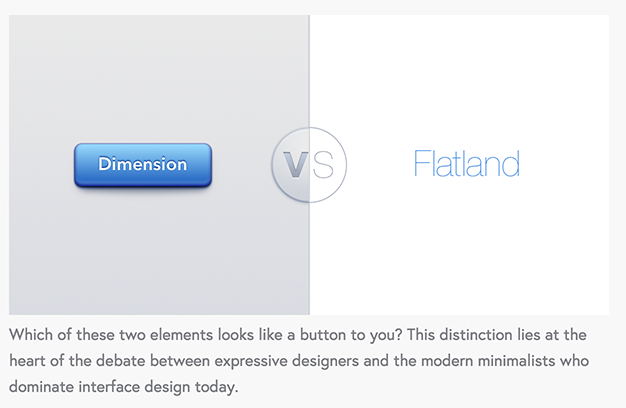
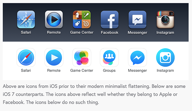
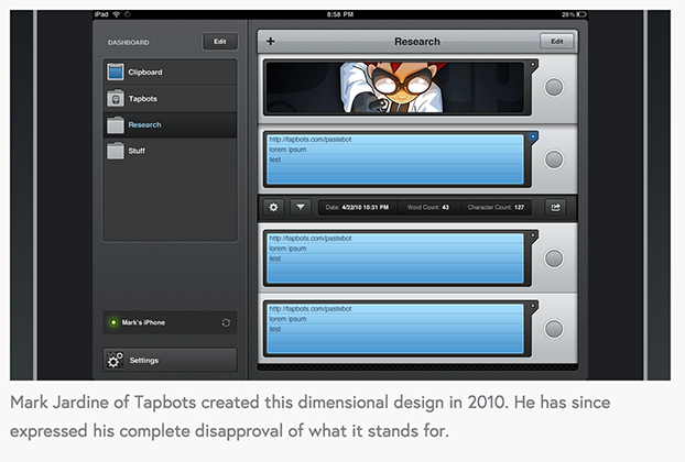
This is dumb. This? Don’t do this. iOS and Android have plenty of obvious buttons. This is a deliberately bad comparison, because in the right context either is a valid button. Hell, if you don’t think colored text is occasionally viable in a user interface, I think we need to talk about this little thing called hyperlinks.Actually, I think the Safari and Remote icons are just fine. It’s a question of style. Neither Game Center icon is good. Nice switcharoo on the Facebook icon, though. The actual app icon is relatively unchanged, except for the subtraction of the gloss-thing at the bottom. Also – that’s not the Instagram icon!Wait, are we defending gradients everywhere and random cartoon characters in a clipboard UI?Yes! This is a good example!
Flat design isn’t why designers are encourage to code, it’s not why prototyping is important, and it’s not why design careers have the lifespan of a mayfly.
Arguments in bad faith don’t help.
I do agree with Mr Schiff that it’s highly overblown as a design trend, and needs to be de-coupled from our perception of modern design. Everything else? Where the fuck was he when Flash was cool? I have one name: 2advanced. If you know what I’m talking about, you’re cringing inside.