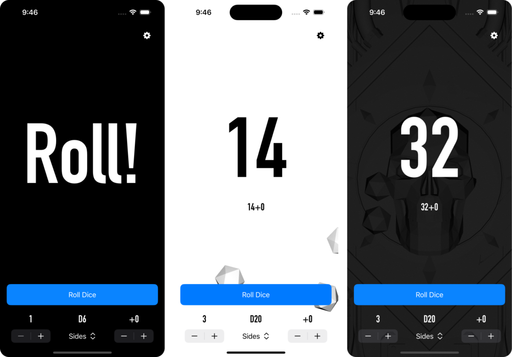
iOS App 1, an update

I’ve reached an interesting branching point in my iOS app: I don’t know if it’s worth finishing or not. Over the past couple months, I’ve made quite a lot of progress: the app is 100% functional, with 3 modes, and 4 themes. It’s partially localized, bug free (as near as I can tell), stable, fast, and in general, it looks pretty good. In fact, all that’s left is to polish the UI and put the alternative themes behind a paywall – and I may stop here.

When to call it quits

Even though the app is probably 95% done, I think this is where I’ll leave it.

  1. I’ve learned a lot about SwiftUI and app dev, and while I love the language, I hate Apple’s developer experience with a passion. Xcode is painfully slow, and their documentation constantly feels incomplete and lacks examples, leading to wasted hours.
  2. My plan was to place the additional themes behind a paywall to see if I could break even with the cost of the account. I spent a good 8 hours trying to figure out how to implement in-app purchases because none of Apple’s dev documentation mentions that you must have your account and app fully registered with them to accomplish any experimentation.
  3. I also intend to register an LLC to be the public owner of the software and account so it’s not tied to my personal Apple ID. This adds more to the required ROI, and I want to make sure I don’t accidentally get into tax troubles.
  4. None of the above is that big of a deal, except there’s still no guarantee my app gets published – if Apple decides I’ve broken some obscure rule, or that my app is too similar to the other dice rolling apps out there, that’s months of wasted work.
  5. Frankly, I’m frustrated with Apple’s handling of virtually everything to do with their App ecosystem and I’m not sure I want to be in that ecosystem right now, or if I’d rather build for the web.
  6. I’m not sure I’m actually willing to sign up for long-term code ownership of a product and take on the burden of bug fixes, OS updates, and so on.

I’m not definitely call it quits on this – just examining my priorities. I actually have a much more interesting app idea for fitness and habit tracking bouncing that is more interesting. And I’ve got a backlog of game design prototypes I’d like to build out – and I miss just ‘creating art.’ And ultimately that’s what this is all about – learning and having fun. And if I learned what I can, and I’m not having fun, maybe this is a good place to call it.

iOS: App 1

My goal for 2024 is to release an app to the iOS App Store. While this is a… turbulent… time for Apple’s control and influence over the future of their platform, it’s my preferred platform and a natural place to start.

My first app is a simple dice rolling app. It’s simple, self-contained, and has easy opportunities for enhancement. I’ll need simple view and navigation controls to switch between different modes (such as a DND-like mode, or rolling a pile of D6s and counting “successes”, or counting individual results of a roll. I can add more fun interactions and animations over time, including experimenting with 3D. And finally, it’s self-contained. No networking services, no databases, nothing.

I may never actually release it – I don’t know what the monetization strategy would be (ads, locking alternative themes behind a paywall, restricting the modes available, or something else), but given that it requires a $100 Apple Developer account (and an LLC, if I want to keep it separate from my personal stuff), I feel compelled to think this through (even if I end up just giving it away).

By the way, here’s my first impressions of developing in Xcode:

  • While my Intel Mac Mini might not be fresh, the basics of text editing should not feel so slow.
  • Xcode in general feels like a mess. It’s slow and buggy, particularly when trying to preview your app. It certainly doesn’t do anything to make the “creation” of an app easy.
  • Apple’s design and developer documentation is lacking. Design documentation (the Human Interface Guidelines) and code documentation are separate, and when the design documents link to code, the code frequently lacks explanations or examples of what was shown.
  • If I’ve learned from shepherding design systems and dev tools over the last 3 years, it is: quality documentation that aligns design AND development guidance is critical to having something actually be adopted and used as intended.

2023 is Done.

I made 2023 my year to prototype games in Unity, with a goal of completing 12 prototypes. I completed that goal with less than a week to spare.

They’re not all available, but here’s what I published online (Warning: these are all protoypes, with high levels of jankiness. You’ve been warned.)

  1. Pillar Breaker – A simple demo of first-person controls, asset importing, and physics.
  2. Train Station – 3rd person movement, animation, and environmental collision set at the Hamilton, NJ train station.
  3. Line Simulator – Simple grid-based movement, simulating waiting in line. Riveting, I know.
  4. Flight Simulator – Simulating the experience of airline travel, from the perspective of a passenger. This extends Line Simulator, but with more interactions and dialog.
  5. Planet Runner – An experiment with importing and controlling models and animations from Mixamo, alongside more complex movement controls and world interactions.
  6. Squish – More involved shading and scenery design, based on the fishing pier in Edmonds, WA.
  7. Squid – Controlling a custom model and animation, alongside some more lighting and rendering experiments.
  8. Jigging – A relatively complete prototype of a game about jigging (fishing) for squid in Puget Sound.
  9. Grid Game – A turn-based tactical combat game, which uses grids and A* pathfinding for movement.
  10. TurnBasedBattler – a prototype for a turn-based RPG which uses Blackjack as a base for conflict resolution instead of dice rolls.

I mentioned in my last post that this was a strategic effort to learn a new skill. Not that I’m going to be jumping into full-time game dev anytime soon, nor am I planning to become a developer, but it gave me a concrete goal to reach while integrating the skills I already have.

The biggest skills I learned? How to consume developer documentation, and how to balance building “fast” versus building “good” for a prototype.

On being ‘strategically creative’

When is the last time you really thought about why you have the creative hobbies you have? No, this isn’t about monetizing your every waking moment – it’s the opposite, quite honestly.

I’ve been thinking about goals lately, and what they have to do with creativity outside of our day jobs. Why did I set a goal of creating 12 Unity prototypes this year? Well, in a general sense, it’s because I like games, and I’m curious about how they’re made. And frankly, I think one of the most interesting areas for design is interaction with space – even simulated spaces. Combined with Unity’s relative approachability and the amount of learning resources, it seemed a natural fit given that I can code (poorly) and 3D model (also poorly).

But why “12 prototypes?” Why not “learn Unity” or “make a game”? Put shortly, “12 prototypes gives me a lot of room for failure. Unity is a huge ecosystem, and if my goal is to simply “learn Unity” does that mean I just want to do basic game logic in C#, or should I get into shader programming? What if my goal is to make a game? Well, then I need to do a whole bunch of learning anyway to make something that will, mostly likely, be crap – leading to a year that’s filled with disappointment. So I limit myself to prototypes (quick, imperfect, and educational), and I want to make a bunch of them to avoid over-investing in any area. That way, if I finish the year and I only get 8 done, I’ve still gotten over halfway to my goal and I still have something to show for it (as opposed to the abandoned game and tutorials I’d probably be staring at in GitHub if my goal was something else). But, because prototypes still imply that they do something, I still need to be intentional about my exploration to actually do something – not just daydream.

That’s it. No productivity hacks, no push to monetize my life – just a way to try to keep myself motivated to be curious so that when the next thing comes along, I’m energized to try it.

2023: My Year of Unity

I play a lot of games. A LOT of them. (Seriously, I created 2 video game UX explorations for fun – #1, #2, and did a whole series of JRPG soccer kits.) I think they’re excellent examples of how UX can be (or should have been) considered in complex interactive environments and differing physical and hardware constraints. Although I’ve never particularly considered a career in game development, I’m interested in the process and have a long-term goal of creating a small game. I had always assumed that would be a tabletop game, but at the end of 2022, I decided that I would tackle Unity as my creative goal for the year.

Here’s my first shared prototype: a simple experience where you click on pillars to destroy them. The first “shot” cracks them, the second causes them to explode. It’s a simple bit of camera control, raycasting, object swapping, and physics. Here’s to (at least) 11 more.

2022 Website Post-Mortem

In 2022, I chose to rebuild my main website and portfolio and danielboyle.net. At the time, things at Amazon seemed incredible stable (a recent promotion, solid core business fundamentals, and a good team). I, like thousands of other Amazon employees are now staring down a suddenly the possibility of being one of thousands of employees laid off in the next week. While I wish I could claim some special bit of insight that lead me to start working on this nearly a year ago, the reality is that:

  1. Portfolios take a long time to build. This is a major criticism from the people who want to see portfolios removed from the hiring process. They effectively discriminate against people with full-time jobs, or multiple jobs, or family responsibilities, or something that reduces their free time. It’s a fair criticism, but as a person with family responsibilities, a full-time job, and hobbies, my free time is precious. I spent months gathering artifacts, working on content or design updates a bit at a time, between other commitments, in order to avoid a single large period of crunch.
  2. I began to dislike the content architecture of my previous site. All of my UX work was divided into two cases studies, which were overly long and awkward to read.
  3. One of my goals for the year had been to learn a modern JS framework and modernize my front-end development skills.

Content

As mentioned, my previously portfolio organized all of my UX work from eBay into two case studies – one for Advertising, and one for Recommendations. This made them awkward to read – important information was removed from each project in order to keep them at a reasonable length for the overall page. Because I rarely retain the more ephemeral work – post-it notes, whiteboard sketches, and the link – this lead to the perception that I was only creating the UI.

I decided to split each project into its own case study in order to find the space to better tell the story of each project. Each project leads with results and outcomes, before diving into the details that are organized in a common structure, focusing on scan-ability. As a hiring manager, the odds that I read a full case study right away are tiny – I’m looking for key words and signals to inform my decision to dive in to the details of your work. Treating myself and my managers as the customer for this content, I’m focusing on results first, with a strong hierarchy of headers and imagines to show process, iteration, and final delivery.

Technical changes

My previous website was a home-brewed PHP-based templating system. It worked quite well for what it was – it effectively separated the content from the presentation logic, so I was able to easily create and edit content sections. It was, however, still difficult to create an entirely new page from scratch, and the templating logic was more complex than it could have been. I wanted to explore a modern JS framework as an alternative to this, and settled on Next.JS. I had explored a few other options, but Next.JS was fast, reliable, and the getting started guide actually produced working code, unlike several frameworks I tried.

Next.JS, along with aggressive use of CSS variables also allowed me to essentially create a miniature design system, which allowed me to remove quite a bit of the redundancy and duplication that existing in my old site. It’s not a perfect platform, though. Next.JS, like many of the frameworks I looked at, injects a significant bit of CSS and Javascript for absolutely trivial tasks. My assumption is that the code assumes that its user can’t or won’t, for example, curate images to correctly fit the content – leading to significant bloat as it attempts to cover every edge case.

Outcomes

In the end, I don’t know that this will perform better or worse than my previous portfolio, nor would I even know how to measure that. There are so many factors that impact a potential job search.

At the very least I can say:

  1. I was able to learn to use a new technology.
  2. That technology has made it easier to develop multiple case studies.
  3. I think those case studies are more readable and better represent my capabilities and contributions.

Portfolios: Thoughts from an intern review

At Amazon, the first time UX teammates see our potential candidate pool is what’s called a “materials review.” A group of 3 people has 90 minutes to review 15 candidates, and judge if they’ll move on to a phone screen and the actual interview loop. This means you have 6 minutes to make an impression on the reviewers. If you’re a candidate, this probably seems horrifically unfair. You (hopefully) spent far more time pulling together your case studies, and you’d like the reviewers to invest a fair chunk of time when reviewing them.

That’s not going to happen.

You need to evaluate your portfolio and understand if, in a 5 minute review, a hiring manager can see the contributions, quality, and impact of your work. This review isn’t everything – it’s just there to understand if you’re worth pursuing further, or if you’re immediately going in the rejection pile.

Note: As of this writing, I haven’t significantly updated my website in years. It doesn’t follow my own advice.

My advice

Make sure I can view multiple projects at the same time. Most reviewers try to open every project in a new window or tab. Don’t use a provider or template that forces me to click through read a single case study, scroll back up to your navigation, and click through to another case study.


Lead with the results. Show me what you created, what you contributed, and what the impact was before diving deep into the process.


Share the entire process. Don’t just share your problem, the solution, and the outcome. Particularly for student, intern, and personal projects, the process is generally an idealized double-diamond (or whatever process you pick). Take advantage of that to share the different ideas you explored, how and why you chose one solution to move forward with, and how you iterated based on your discoveries.


Seriously, show me the other things you considered and why you chose your particular path forward.


Edit your case studies. You are not writing the next great novel in your UX portfolio, and if I start to get bored, I will move on.


Be clear about your personal contributions.


Make sure your problem and your solutions align. I’ve seen multiple case studies where research identifies a unique and interesting problem, only to be completely ignored in the rest of the case study. Two examples spring to mind.

  1. An intern candidate shared a personal project on social media design. They flagged endless scrolling and a lack of meaningful engagement as a problems impacting the mental health of heavy social media users. They ended up designing an endlessly-scrolling photo sharing app with quick-reaction “swipes” as the primary engagement. Based on their own problem statement, they’re repeating the same problems.
  2. A designer created an app focusing on childhood obesity. The UI design was beautiful, and I’m sure gathered a ton of engagement on Dribbble. They did not however, consider how they would speak to children, leaning heavily on medical terminology and “adult” langauge. At no point did they show any awareness of mental health impacts or the risk of eating disorders or other physical harm that could be triggered by this app – or even show any awareness of this.

Related to the above: don’t be afraid to go deep on a single topic. I look for interesting, complicated problems like the above. I admire the ambition to tackle them even if the solutions aren’t perfect – particularly for personal projects – when considering intern and junior candidates. I’d rather see candidates go deep on these problems, instead of ignoring them because they’re hard to solve, or because they feel compelled go wide and communicate an entire product vision.


Focus on your strengths. If you’re not a strong visual designer, focus on your research, user flows, wireframes and other non-UI deliverables. While UX work isn’t only UI, it’s possible to derail an otherwise good UX case study with an absolutely awful visual design.

If you can’t design a good UI yourself, you can at least demonstrate good taste in your use of design systems and UI libraries, as well as a basic understanding of design principles. Learn about gestalt theory, use heuristic evaluations, and design for accessibility.


Make sure your content is correct. We notice when images don’t load, or when you forget to remove placeholder content, and we absolutely hold that lack of attention to detail against you. We are, generally, far more forgiving of minor typos or minor sentence awkwardness, particularly if English is your second language.


This doesn’t guarantee you a job anywhere. But maybe you’ll have better luck.

Keep learning.

Despite working with AI-powered systems for years, I’d never really gotten hands-on with building one. I’ve been working on this Coursera IBM Applied AI course, and finally got past the “advertising for IBM” part. Enjoy this useless chatbot.

A designer’s job is not empathy (and other unpopular opinions about UX design).

Inspired by agreements and disagreements with: Stop telling designers to stop being designers

1. Be a designer.

This is a fair statement: If you are a designer, be a designer. If you’re not a designer, stop telling designers to be something else. This is also an unfair oversimplification.

What is design? In short, it’s synthesis. Whether you’re producing design systems, wireframes, storyboards, or high-fidelity mockups, your value as a designer lies in the ability to take in a dozen disparate, conflicting, ambiguous inputs and create something cohesive, whether you’re design web-based tools or a plate. You can only be good at synthesis if you are able to have other perspectives – not just that of your user, but of services, technology and business as well. To that end, learn about how to understand your users – finding their needs, how they learn, and how to teach them; but also explore web frameworks, business process, and customer service processes (or whatever needs you have).

2. Embrace design.

Your goal is to shape whatever it is that your customer will use. Use your entire design toolset to generate artifacts that shape this process – and design every single one. Every text file. Every wireframe. Every research report. Every mockup. At the end of the day, you’re not just shaping your end user’s experience – you’re shaping the experience of the product manager, who is trying to digest your user journey to understand if we’re doing the right thing (or not).

3. Designers are not researchers or strategists.

Part of embracing design is caring about craft and the end product. I don’t care how many sticky notes you use on a daily basis – our job is to craft a product or experience. If you can’t create that thing, then you’re not a designer.

You might, however, be a researcher or strategist. And while this might sound as if I’m putting them down, I’m not. In fact, I feel that the constant push to make designer also responsible for research and strategy devalues both roles.

4. Empathy is (hopefully) not your job.

Empathy is not the unique domain of a designer. Literally everyone involved with building a user facing product should have empathy for the user, or they’re doing a bad job. If you genuinely feel that empathy is your sole domain, you might need to develop some.

5. On Job Titles

User Experience Designer is a terrible title because User Experience is a deliberately vague phrase that obfuscates what designers do, and allows everyone else to abdicate their responsibility for the “experience.”

There’s a cliché example that to create a successful restaurant, you don’t just design the menu, you design the experience. This is true, but most of the time, the person who designed the menu is not the person who created the menu, cooks the food, picks out the plates, or designs the lighting and acoustic environments. I prefer the term product designer because those are the things I’m creating – products – just like I work with product managers and product developers (and yes, that’s a real title, meant to differentiate from developers working on infrastructure).

An experience is a nebulous, vague thing with no specificity designed to generate importance via obfuscation. People don’t use an experience. They use software via a UI. They touch physical devices. They play games. They eat at a restaurant. Our job titles should represent the work that we produce, not a sticky-note driven cliché.

Updates in Brief

  1. I’m now a Senior UX designer for Amazon, working to help 3rd party sellers succeed on Amazon. My goal isn’t to make them feel like selling on Amazon is something they must do. I want it to be something that the love doing.
  2. I’ll add updates for my Indeed work when I can. I recently rewrote a the code that creates my Work pages to use section-level templates, instead of tedious copy-pasting of code.
  3. I recently added a project where I redesigned the inventory management UX of Destiny 2, my current go-to video game.